TOWER FEATURE
After launching the game worldwide, our first big update aimed at improving our retention and engagement.
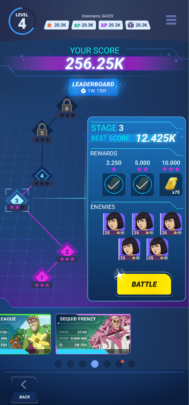
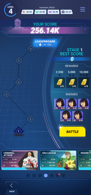
The feature consists of a succession of battles that are time limited. Players progress through the stages and earn a score that will place them in a leaderboard. Adding this competitive mechanic also helped us increase the competitive aspect of our product.


SUMMARY
Below you will find the first released iteration of the feature. Working hand in hand with Artists, Game Designers, Economy Designers, Marketing, QC, Data Analysts and Scientists and of course Frontend and Backend Programmers. The feature took about 2 months to be completed and released.
My main duties consisted of defining, creating and integrating the whole UI and UX with its many details and corner cases. During the whole development, I organised regular sync meetings with all the stakeholders. Updating them on the progress of the various elements needed to complete the feature, aligning accordingly.
PHASE 1: Research & Exploration
As usual, it starts with quick wireframes or sketches. In parrallel, I benchmarked similar experiences and gathered visual references that would fit with our concept and context.


PHASE 2: Flow
Once we had some clearer idea of all the ingredients/ screens we would need, I started to create user flows for the UI, adding all the UX feedbacks, details and corner cases. This makes it great for sharing a centralised slide of information to the Programmers and Game Designers.
![[TRIBES] Tower Feature - Flow - UI Overview_l.png](https://static.wixstatic.com/media/87d82b_c156f7cacf044c79a31bd3ffbc22e752~mv2.png/v1/fill/w_979,h_1043,al_c,q_90,usm_0.66_1.00_0.01,enc_avif,quality_auto/%5BTRIBES%5D%20Tower%20Feature%20-%20Flow%20-%20UI%20Overview_l.png)
PHASE 3: Information Layout
Building a screen does not happen by magic, it takes a lot of trial and error before you get to a satisfying result. My motto has always been "Make it work before you make it beautiful". The following section will run you through the typical experiments/ prototypes/ variations I develop in order to filter bad ideas quickly and narrow down the spectrum to move forward.
1 - SCROLL TESTS


2 - PROGRESSION PATH TESTS
3 - ATMOSPHERE TESTS
4 - STAGE INFO CONTAINERS TESTS
5 - STAGE STATES
6 - HEADER DECORATION TESTS
PHASE 4: Detail & Feedbacks
Once all the visual aspect of the UI and UX has been validated, I started to work on the details of the feature. The wording (keeping in mind the different languages we support), the tone, the transitions, the SFX, the VFX, the feedbacks, the haptics. In other words, all the sensory layers that we can interact with. This part is crucial in adding this extra juiciness layer. This is what makes an experience more satisfying, this is what makes a better Product.


PHASE 5: Other Screens
The feature has multiple screens and mechanics. Once the main screen got validated, I started working on the rest of the content needed. I like to produce animated mock-ups and mini prototypes as guidelines for our Artists, Programmers and Designers. In the example below, you can see the example of an animated mock-up of a cool screen transition idea I had. It was then created and implemented by a Technical Artist.


_edited_edited.png)
_edited.png)
_edited.png)

Credits:
Tania Duarte - UI UX Artist
Andy Garcia Diaz - UI UX Artist
UX Magicians - UI UX Design/ Art
Damien Chevalier - Game Director
Ariadna Castells - Lead Game Designer
Antonio García - Lead Artist
Pedro Aliaga - Game Designer
Chema Olea - Senior UI Programmer
Oscar Faura - UI Programmer
Hannah Becker - Server Programmer
Iker López - Server Programmer
Kendra Muñoz - Technical Artist
Richard De La Rosa - Gameplay Programmer
Hilaire Tribot - Monetization Manager
Virginia Plaza - Economy Designer
Sock Chin Low - Senior Data Scientist
Geoffrey Roig-Deslandes - Data Analyst
Deborah Kerr - Marketing


